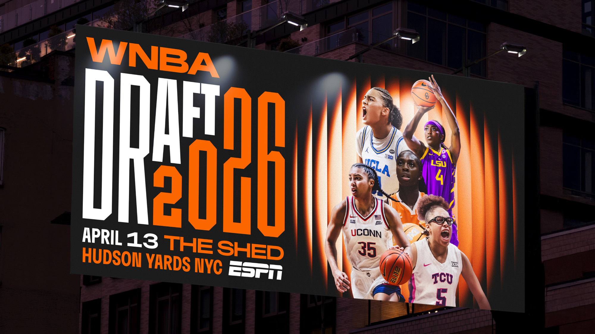
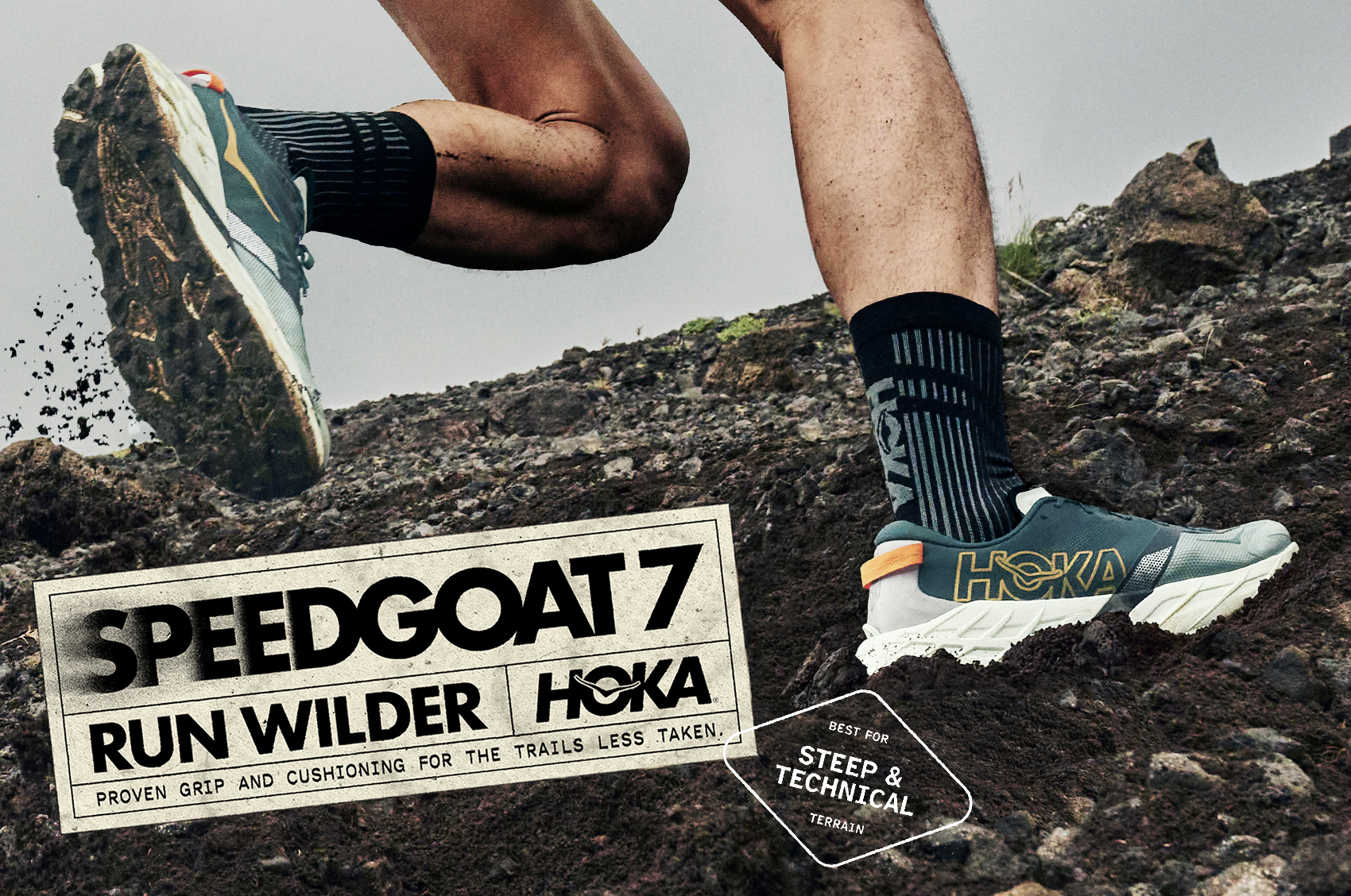
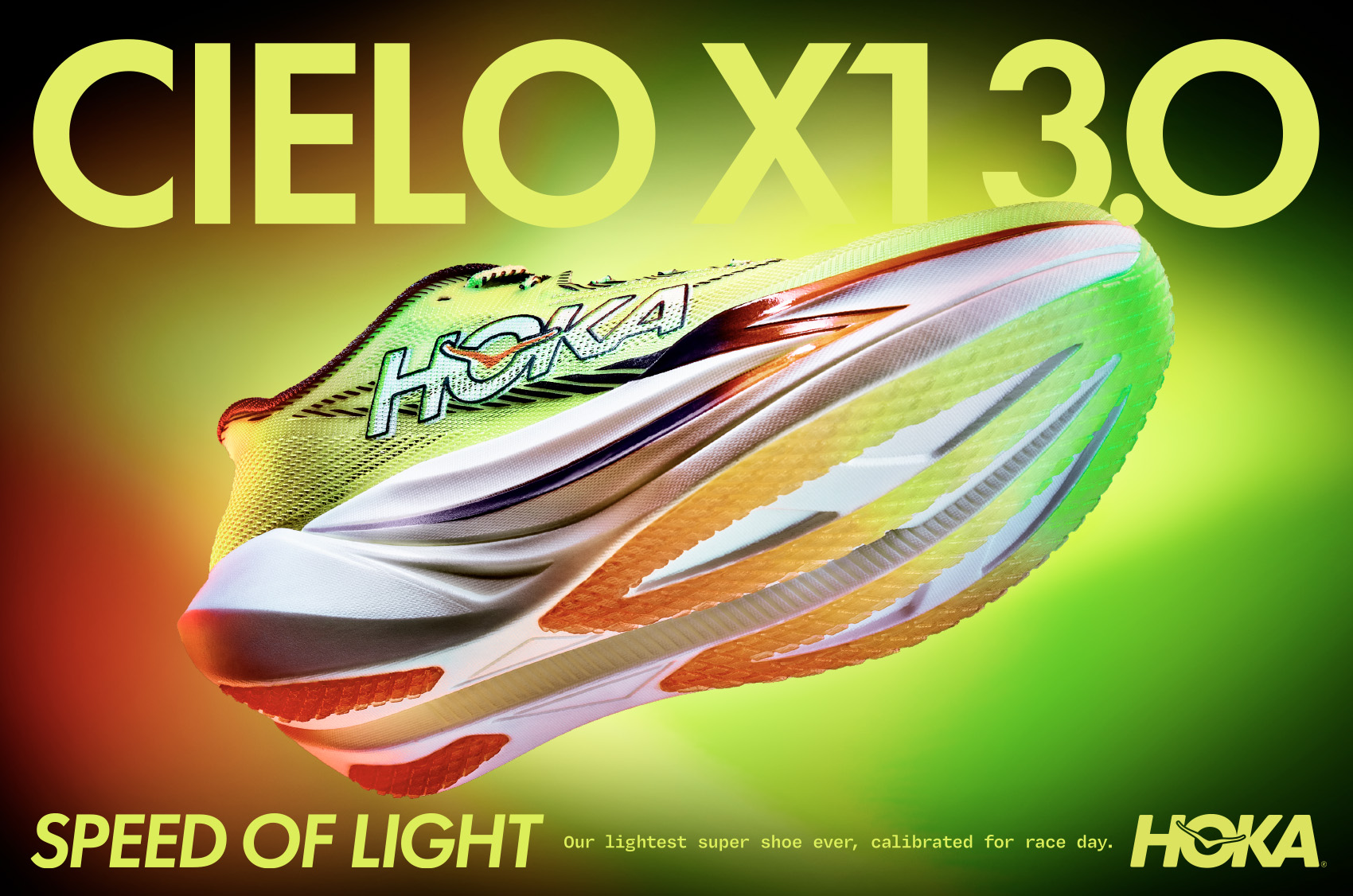
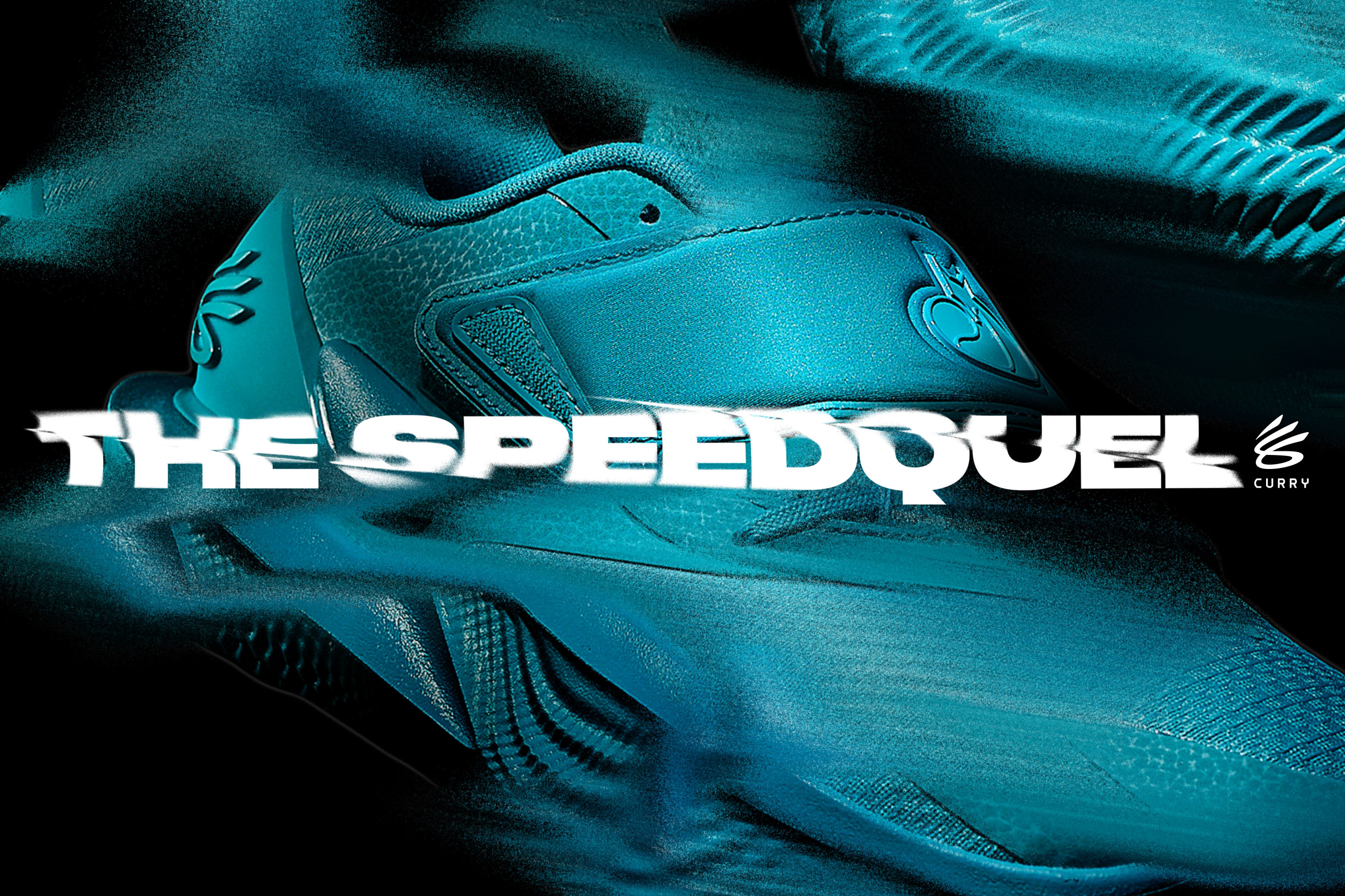
CÎROC

branding & identity
Ciroc 5 1610 cover
CÎROC, one of the world’s finest vodkas, tasked our team with a complete re-brand & visual identity. We customized and re-contextualized the circumflex above the ‘Î’ in CÎROC to reinforce the brands new positioning of upward mobility. By turning a simple typographic diacritical mark into an iconic symbol that honors the perseverance behind success, it speaks to the brand’s ethos of inspiring a new generation to hustle for their dreams and celebrate with CÎROC along the way.
Ciroc 1
Ciroc 2
Ciroc 5 163 retouch
Ciroc 6
Ciroc 4 copy
Ciroc 7
Ciroc 1 16 25 copy
Ciroc 5 1612 copy
Ciroc 12
Ciroc 1 16 7
Ciroc 5 1627 copy
Ciroc 5 1628
Ciroc 15
Ciroc 16
Ciroc 17
Ciroc 18
Ciroc 19
Ciroc 1 16 22
Ciroc 1 16 16
Ciroc 5 1614 copy
Ciroc Bag 2 copy
Ciroc 1 24
Ciroc 1 16 26
Ciroc 1 16 27
Ciroc 1 16 28
Ciroc 1 16 31
Ciroc 1 16 32
Ciroc 1 16 33
Ciroc