GOTHAM Welcome to Gotham
We were invited to rebrand the legendary advertising agency GOTHAM. The goal was to create an identity that honors its heritage while signaling forward momentum.
Our exploration centered on the idea of place, what defines it, both physically and conceptually, and how it can evolve without losing its essence. For Gotham, this meant celebrating decades of iconic work while making space for what’s next.
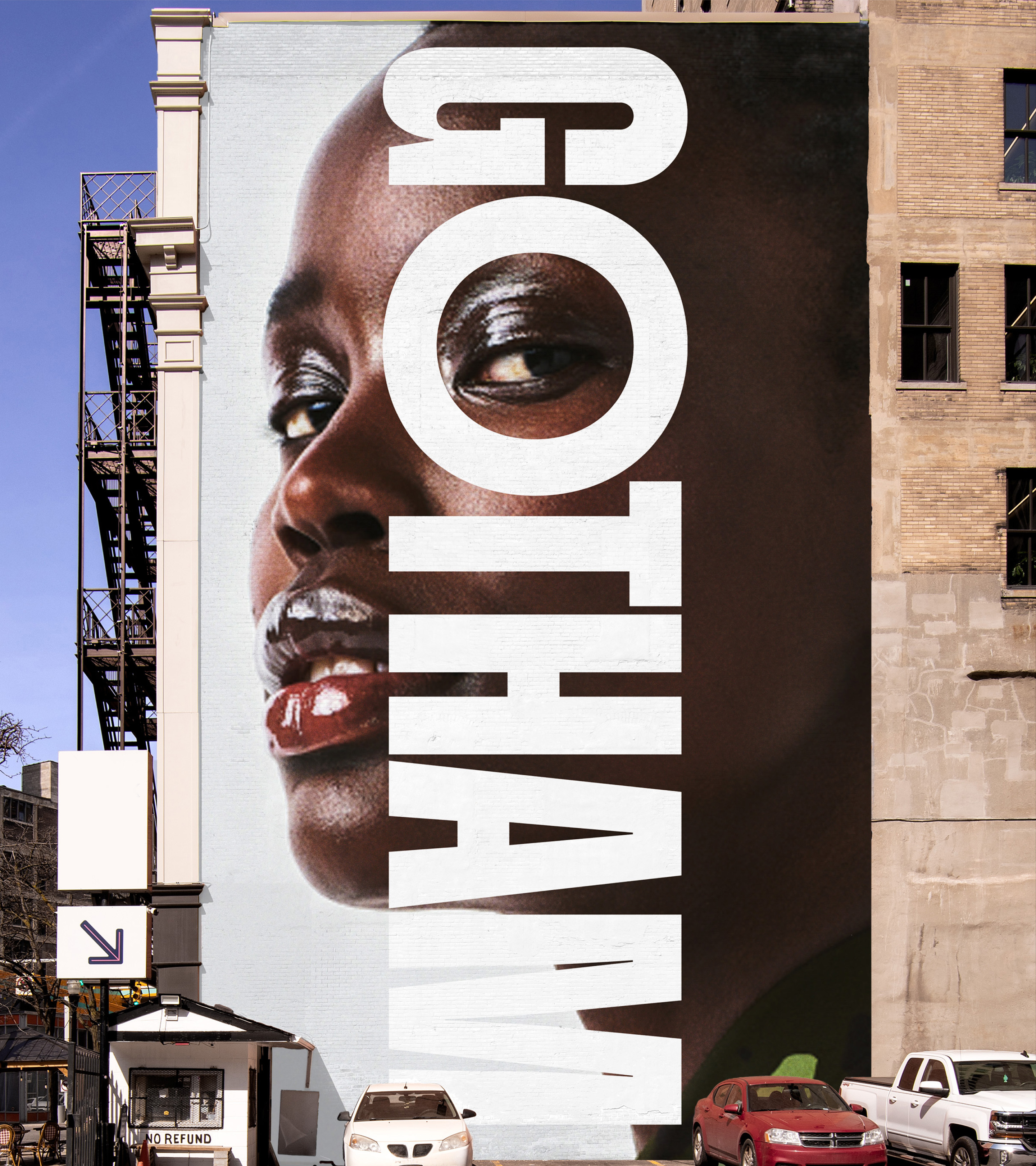
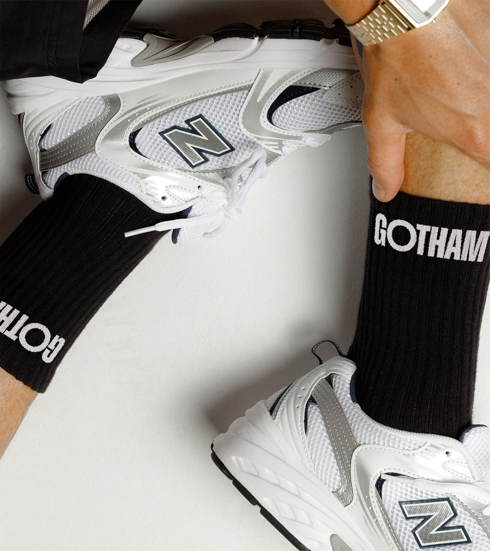
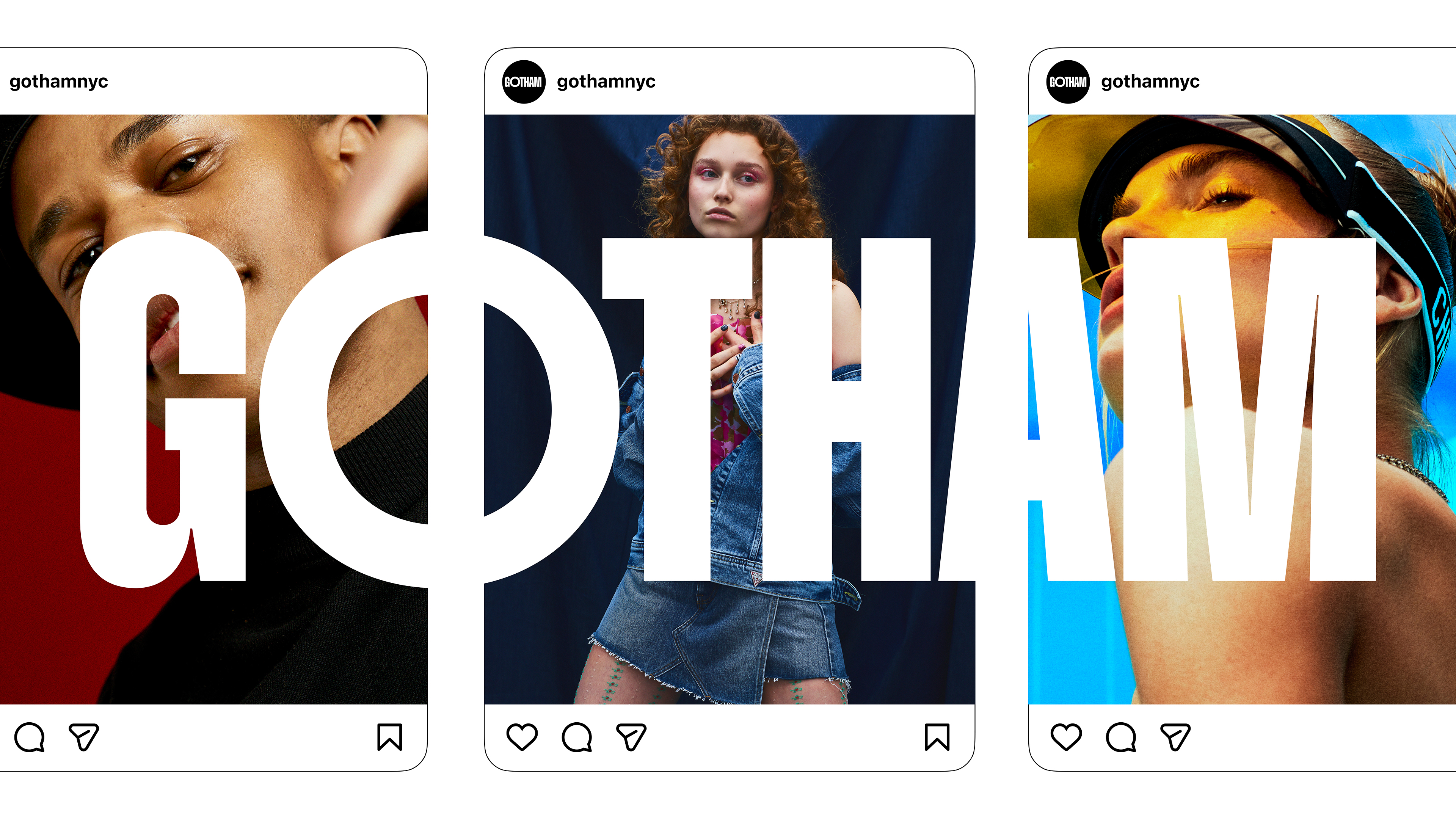
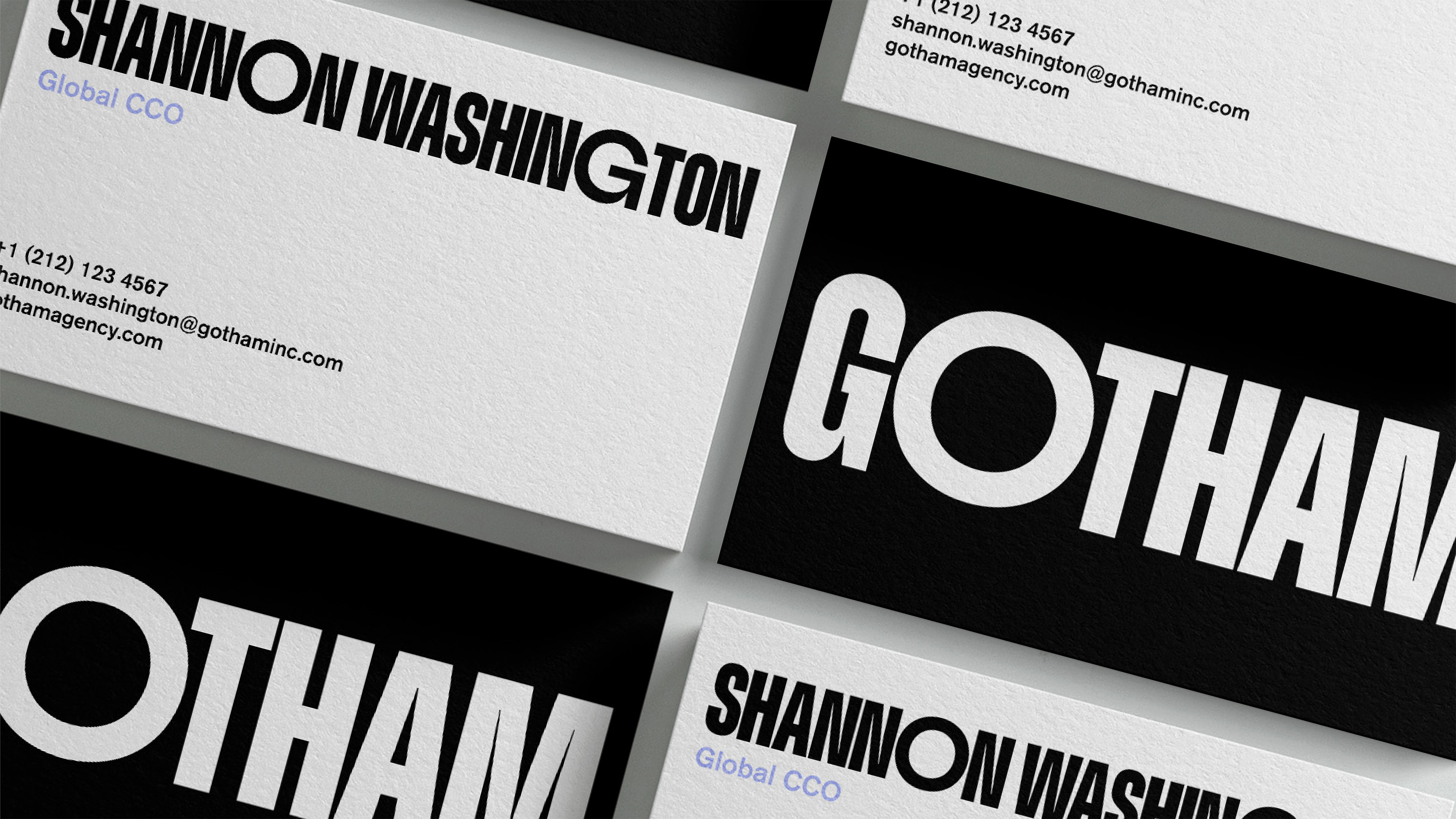
The result is a bold, typographic identity system that’s simple, dynamic, and unmistakably Gotham. At its core is a logotype that feels strong yet flexible—ever-changing, yet always itself. By retaining the prefix “GO” within GOTHAM, the identity becomes inherently action-oriented: a subtle but powerful reminder that this is a place defined by movement, creativity, and constant growth.
GO GOTHAM GO.